Overview
The ggtda package provides ggplot2 layers for the visualization of constructions and statistics arising from topological data analysis.
Installation
The development version can be installed used the remotes package:
# install from GitHub
remotes::install_github("tdaverse/ggtda", vignettes = TRUE)
For an introduction to package functionality, read the vignettes:
# read vignettes
vignette(topic = "visualize-persistence", package = "ggtda")
vignette(topic = "illustrate-constructions", package = "ggtda")
vignette(topic = "grouped-list-data", package = "ggtda")
We aim to submit to CRAN in Spring 2024!
Example
# attach {ggtda}
library(ggtda)
#> Loading required package: rlang
#> Loading required package: ggplot2
Sample data set
This example illustrates ggtda features using an artificial point cloud X sampled with noise from a circle:
# generate a noisy circle
n <- 36
set.seed(0)
t <- stats::runif(n = n, min = 0, max = 2*pi)
d <- data.frame(
  x = cos(t) + stats::rnorm(n = n, mean = 0, sd = .2),
  y = sin(t) + stats::rnorm(n = n, mean = 0, sd = .2)
)
# plot the data
ggplot(d, aes(x, y)) + geom_point() + coord_equal() + theme_bw()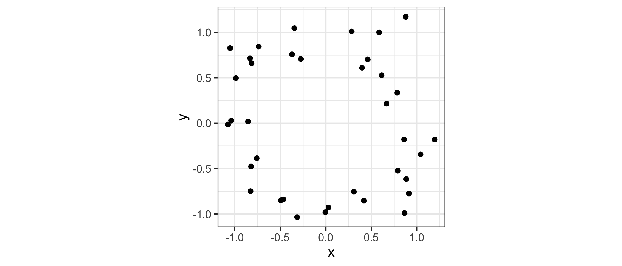
Topological constructions
ggtda provides stat and geom layers for common TDA constructions. To illustrate, pick a proximity, or threshold, to consider points in the cloud to be neighbors:
# choose a proximity threshold
prox <- 2/3
The homology Hk(X) of a point cloud is uninteresting (H0(X) = |X| and Hk(X) = 0 for k > 0). The most basic space of interest to the topological data analyst is the union of a ball cover Br(X) of X—a ball of common radius r around each point. The common radius will be r= prox / 2.
The figure below compares the ball cover (left) with the Vietoris (or Rips) complex VRr(X) constructed using the same proximity (right). The complex comprises a simplex at each subset of points having diameter at most prox—that is, each pair of which are within prox of each other. A key result in TDA is that the homology of the ball union is “very close” to that of the complex.
# visualize disks of fixed radii and the Vietoris complex for this proximity
p_d <- ggplot(d, aes(x = x, y = y)) +
  coord_fixed() +
  geom_disk(radius = prox/2, fill = "aquamarine3") +
  geom_point() +
  theme_bw()
p_sc <- ggplot(d, aes(x = x, y = y)) +
  coord_fixed() +
  stat_simplicial_complex(diameter = prox, fill = "darkgoldenrod") +
  theme_bw() +
  theme(legend.position = "none")
# combine the plots
gridExtra::grid.arrange(
  p_d, p_sc,
  layout_matrix = matrix(c(1, 2), nrow = 1)
)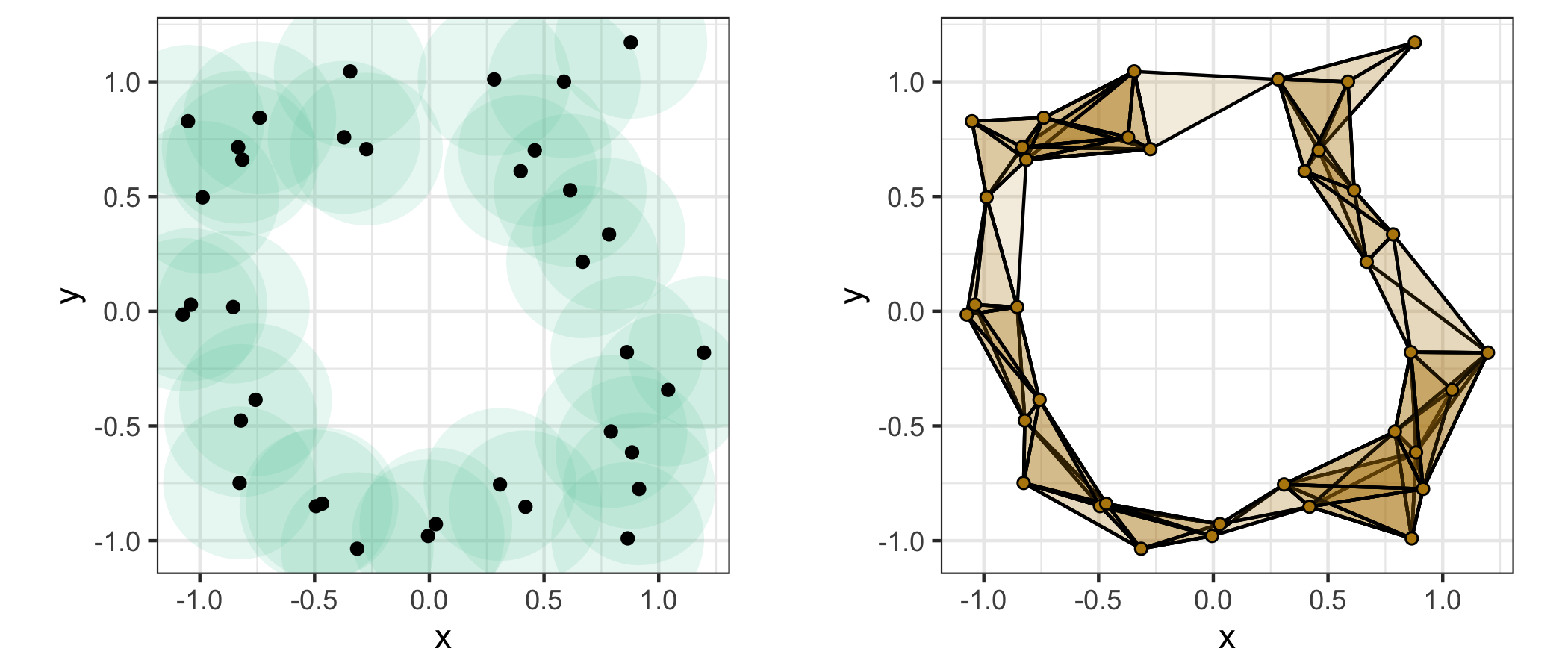
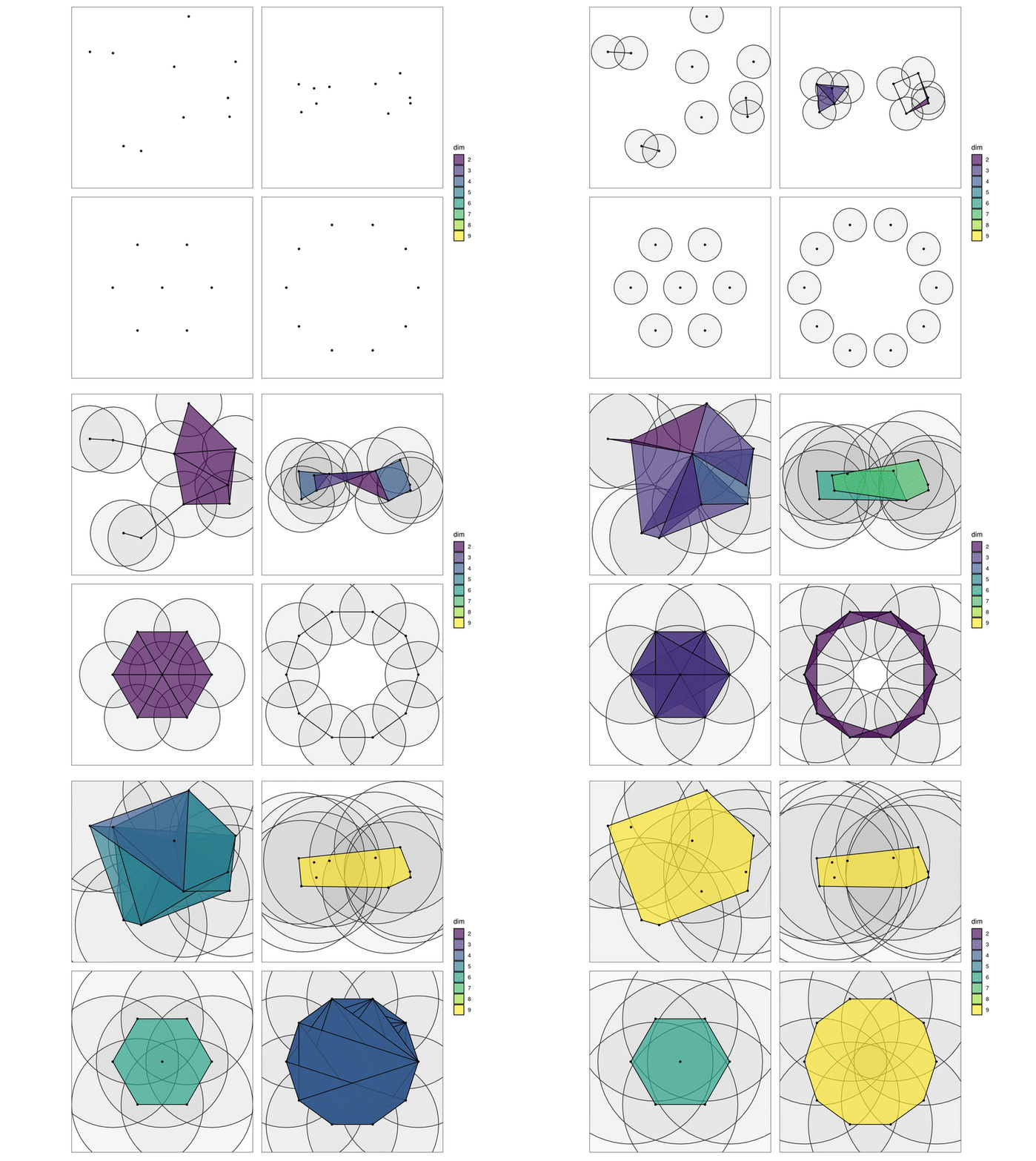
This cover and simplex clearly contain a non-trivial 1-cycle (loop), which makes H1(Br(X)) = H1(VRr(X)) = 1. But detecting this feature depended crucially on the choice of prox, and there’s no guarantee with new data that this choice will be correct or even that a single best choice exists. Instead, we tend to be interested in considering those features that persist across many values of prox. The GIF below1 illustrates this point: Observe how features appear and disappear as the disk covers grow:
Persistent homology
Persistent homology (PH) encodes the homology group ranks across the full range 0 ≤ r < ∞, corresponding to the full filtration of simplicial complexes constructed on the point cloud. We use ripserr to compute the PH of the point cloud X:
# compute the persistent homology
ph <- ripserr::vietoris_rips(as.matrix(d), dim = 1)
#> Warning in vietoris_rips.matrix(as.matrix(d), dim = 1): `dim` parameter has
#> been deprecated; use `max_dim` instead.
print(ph)
#> PHom object containing persistence data for 36 features.
#>
#> Contains:
#> * 35 0-dim features
#> * 1 1-dim feature
#>
#> Radius/diameter: min = 0; max = 1.3963.
The loop is detected, though we do not yet know whether its persistence stands out from that of other features. To prepare for ggplot(), we convert the result to a data frame and its numeric dimension column to a factor:
pd <- as.data.frame(ph)
pd <- transform(pd, dimension = as.factor(dimension))
head(pd)
#>   dimension birth      death
#> 1         0     0 0.02903148
#> 2         0     0 0.05579919
#> 3         0     0 0.05754819
#> 4         0     0 0.06145429
#> 5         0     0 0.10973364
#> 6         0     0 0.11006440
tail(pd)
#>    dimension     birth     death
#> 31         0 0.0000000 0.3775456
#> 32         0 0.0000000 0.4159706
#> 33         0 0.0000000 0.4386794
#> 34         0 0.0000000 0.4664572
#> 35         0 0.0000000 0.4708476
#> 36         1 0.6282155 1.3962621
Persistence plots
ggtda also provides stat and geom layers for common visualizations of persistence data. We visualize these data using a barcode (left) and a persistence diagram (right). In the barcode, the dashed line indicates the cutoff at the proximity prox; in the persistence diagram, the fundamental box contains the features that are detectable at this cutoff.
# visualize the persistence data, indicating cutoffs at this proximity
p_bc <- ggplot(pd, aes(start = birth, end = death)) +
  geom_barcode(linewidth = 1, aes(color = dimension, linetype = dimension)) +
  labs(x = "Diameter", y = "Homological features",
       color = "Dimension", linetype = "Dimension") +
  geom_vline(xintercept = prox, color = "darkgoldenrod", linetype = "dotted") +
  theme_barcode()
max_prox <- max(pd$death)
p_pd <- ggplot(pd) +
  coord_fixed() +
  stat_persistence(aes(start = birth, end = death,
                       colour = dimension, shape = dimension)) +
  geom_abline(slope = 1) +
  labs(x = "Birth", y = "Death", color = "Dimension", shape = "Dimension") +
  lims(x = c(0, max_prox), y = c(0, max_prox)) +
  geom_fundamental_box(
    t = prox,
    fill = "darkgoldenrod", color = "transparent"
  ) +
  theme_persist()
# combine the plots
gridExtra::grid.arrange(
  p_bc, p_pd,
  layout_matrix = matrix(c(1, 2), nrow = 1)
)
The barcode lines are color- and linetype-coded by feature dimension: the 0-dimensional features, i.e. the gaps between connected components, versus the 1-dimensional feature, i.e. the loop. These groups of lines do not overlap, which means that the loop exists only in the persistence domain where all the data points are part of the same connected component. Our choice of prox is between the birth and death of the loop, which is why the complex above recovers it.
The persistence diagram shows that the loop persists for longer than any of the gaps. This is consistent with the gaps being artifacts of the sampling procedure but the loop being an intrinsic property of the underlying space.
Multiple data sets
TDA usually involves comparisons of topological data between spaces. To illustrate such a comparison, we construct a larger sample and examine the persistence of its cumulative subsets:
# larger point cloud sampled from a noisy circle
set.seed(0)
n <- 180
t <- stats::runif(n = n, min = 0, max = 2*pi)
d <- data.frame(
  x = cos(t) + stats::rnorm(n = n, mean = 0, sd = .2),
  y = sin(t) + stats::rnorm(n = n, mean = 0, sd = .2)
)
# list of cumulative point clouds
ns <- c(12, 36, 60, 180)
dl <- lapply(ns, function(n) d[seq(n), ])
First we construct a nested data frame containing these subsets and plot their Vietoris complexes. (We specify the simplextree engine and restrict to 2-simplices to reduce runtime.)
# formatted as grouped data
dg <- do.call(rbind, dl)
dg$n <- rep(ns, vapply(dl, nrow, 0L))
# faceted plots of cumulative simplicial complexes
ggplot(dg, aes(x, y)) +
  coord_fixed() +
  facet_wrap(facets = vars(n), labeller = label_both) +
  stat_simplicial_complex(
    diameter = prox, dimension_max = 2L,
    engine = "simplextree",
    fill = "darkgoldenrod"
  ) +
  theme_bw() +
  theme(legend.position = "none")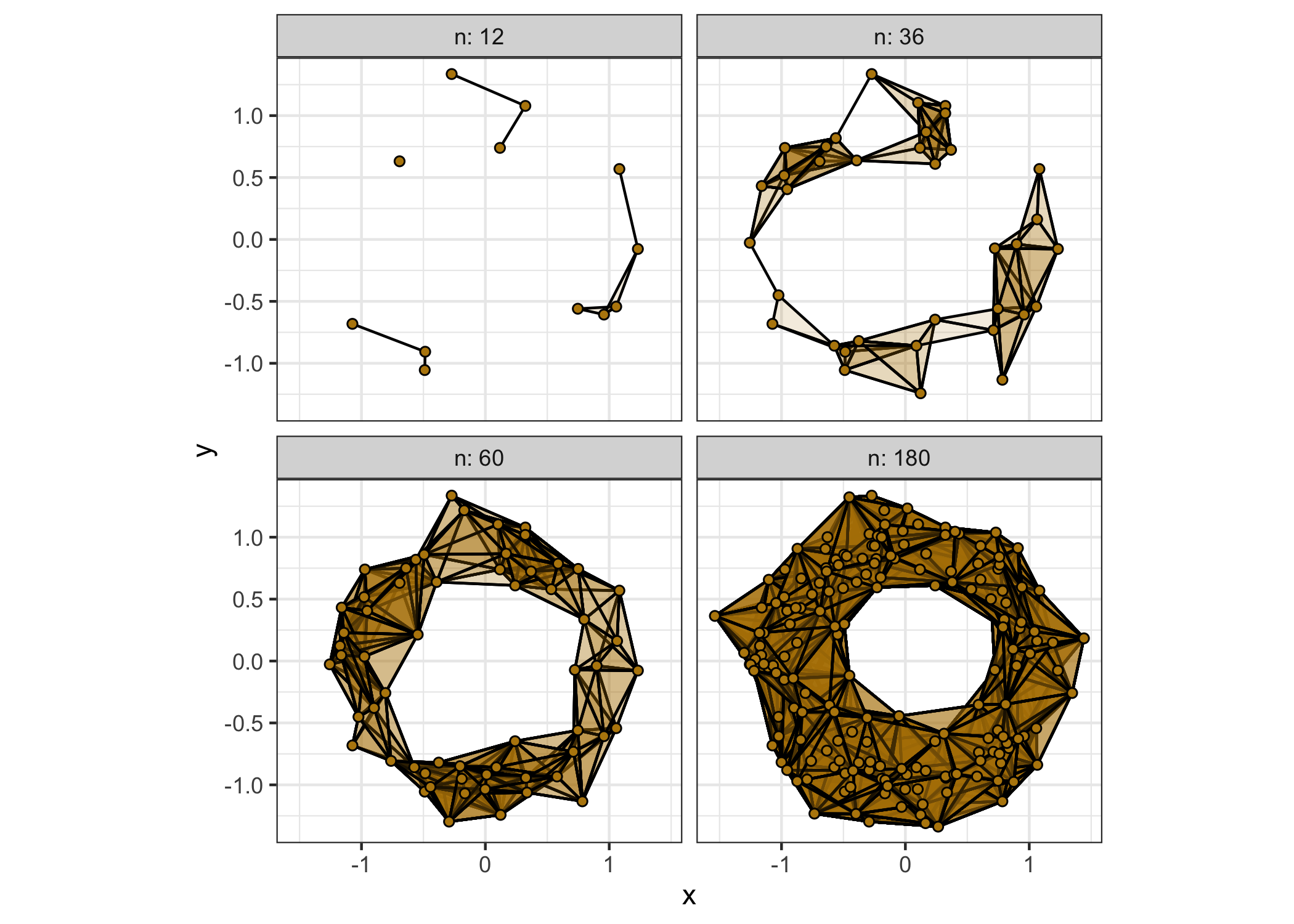
The Vietoris complexes on these subsets for the fixed proximity are not a filtration; instead they show us how increasing the sample affects the detection of homology at that threshold. Notice that, while a cycle exists at n = 36, the “true” cycle is only detected at n = 60.
We can also conveniently plot the persistence diagrams from all four cumulative subsets, this time using a list-column of data sets passed to the dataset aesthetic:
# nested data frame of samples of different cumulative sizes
ds <- data.frame(n = ns, d = I(dl))
print(ds)
#>     n            d
#> 1  12 c(1.0565....
#> 2  36 c(1.0565....
#> 3  60 c(1.0565....
#> 4 180 c(1.0565....
# faceted plot of persistence diagrams
ggplot(ds, aes(dataset = d)) +
  coord_fixed() +
  facet_wrap(facets = vars(n), labeller = label_both) +
  stat_persistence(aes(colour = after_stat(factor(dimension)),
                       shape = after_stat(factor(dimension)))) +
  geom_abline(slope = 1) +
  labs(x = "Birth", y = "Death", color = "Dimension", shape = "Dimension") +
  lims(x = c(0, max_prox), y = c(0, max_prox)) +
  theme_persist()
#> Warning: Removed 2 rows containing missing values or values outside the scale range
#> (`geom_point()`).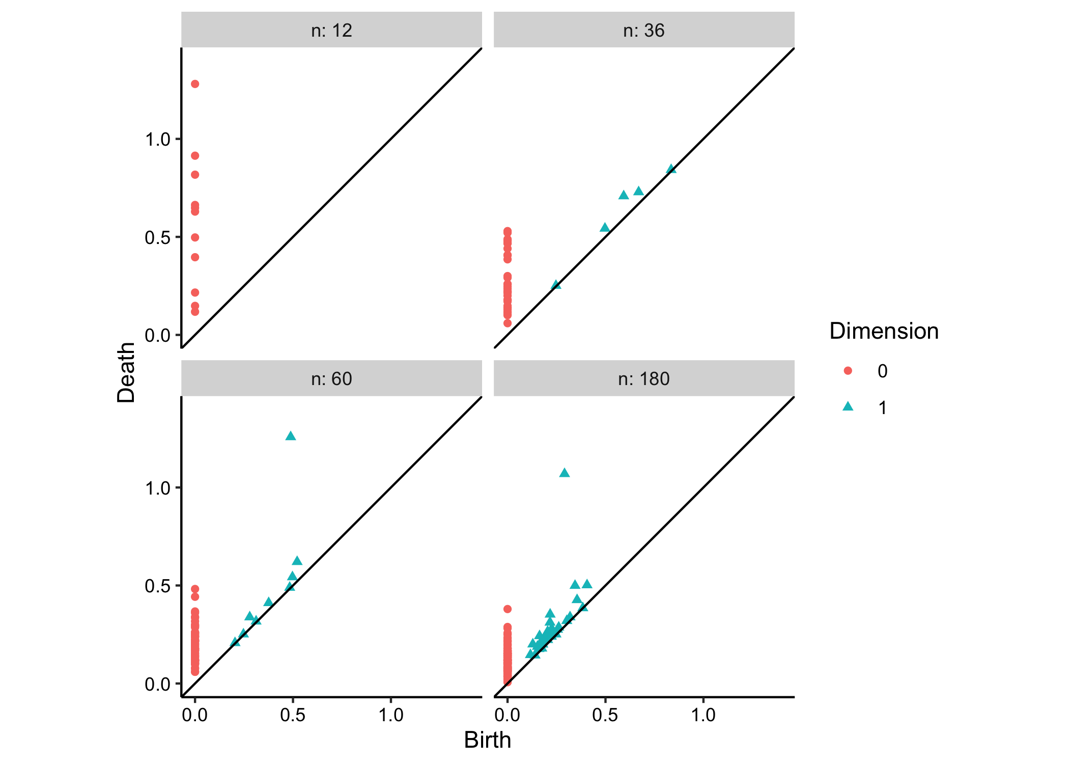
The diagrams reveal that a certain sample is necessary to distinguish bona fide features from noise, as only occurs here at n = 36. While the true feature retains about the same persistence (death value less birth value) from diagram to diagram, the persistence of the noise gradually lowers.
Contribute
To contribute to ggtda, you can create issues for any bugs you find or any suggestions you have on the issues page.
If you have a feature in mind you think will be useful for others, you can also fork this repository and create a pull request.

